In August 1992, Evan Chung and his friends decided to check out a post-event volunteer meeting partly because it happened to be close to him. He had previously attended Anime Con 1991 and was impressed by the number of guests who visited from Japan. When he checked out Anime Expo the following year, he knew that some of the same people from Anime Con were involved but wasn’t too clear on why the name changed.
After attending Anime Expo 1992, he considered getting more involved in volunteering. At the fateful volunteer meeting in Oakland, Evan learned that the folks who had previously handled the publication layout and design for Anime Expo decided to start their own convention called Anime America. With a background working in graphic design, Evan volunteered to step in.
SPJA’s founder and CEO Mike Tatsugawa shared during the meeting that he had plans to visit industry members in Japan to start the discussions for the following year’s event. He wanted to develop a logo for Anime Expo to convey a professional corporate image–the goal was to have the logo and business card ready to share at his meetings in Japan and to distinguish Anime Expo as a separate entity from Anime America. Evan had just one month to create the logo and business cards for the trip.
How the AX Logo Was Made
During the meeting, they immediately started to brainstorm ideas. The first question that popped up was: should we abbreviate Anime Expo as “AE” or “AX”? According to Evan, everyone gravitated toward “AX” because it “sounded cooler.” Mike suggested a blue and gold color scheme as an homage to UC Berkeley but was outvoted in favor of the red and black color scheme. (The folks who didn’t attend UC Berkeley weren’t too keen on the idea of blue and gold.) Evan’s initial design took inspiration from the Japanese flag and incorporated an oval shape. The red color scheme also made the design stand out so that you could see it from a distance.
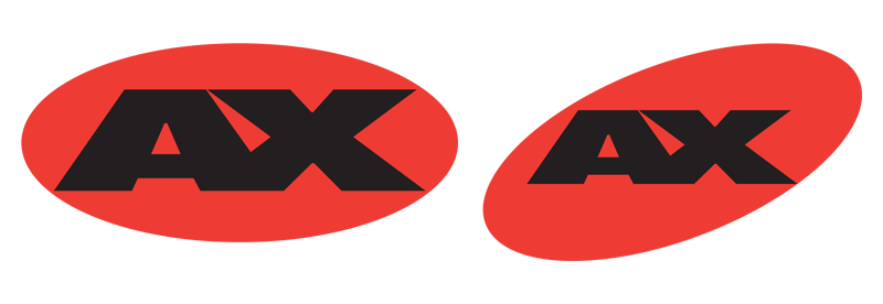
Rejected Logo Designs
Concerned about stereotypes surrounding Japan at the time, however, Mike asked to distance the Anime Expo logo from Japanese imagery. After playing around with the shapes, Evan settled on the now-iconic box shape.

Final Result
From there, Evan got to work incorporating the new Anime Expo logo into the business card design. He made the logo front and center so that it would “pop like hell” when you spun through a Rolodex. (If you’re not familiar with Rolodex, they are a rotating business card file system.)
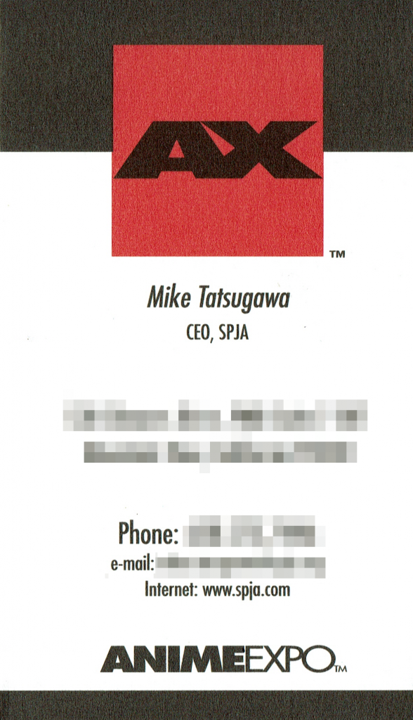
The feedback from the various companies that Mike Tatsugawa met with was positive. They noticed that people really looked at the card and the professionalism that the AX/SPJA team displayed helped the participating companies give confidence in Anime Expo.
1993 – 2016
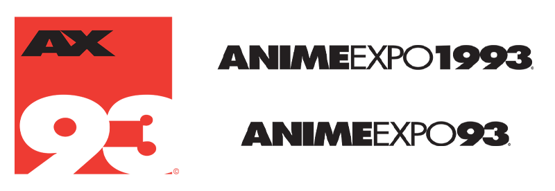
At Anime Expo 1993, the striking red box logo was officially rolled out on the program guides, badges, and merchandise. Anime Expo’s logo remained unchanged from 1993 to 2016.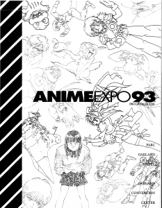
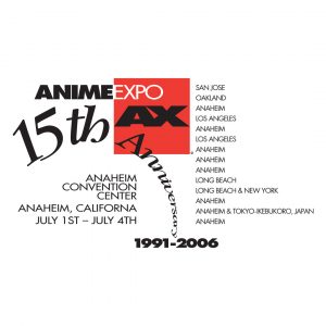
Although Anime Expo moved down to Southern California in 1994, Evan continued to stay involved and handled a variety of design projects including program guide layouts, postcards, badges, merchandising, and even anniversary logos for Anime Expo up until 2006.
Brand Update: 2017 to Present
In 2017, SPJA updated the Anime Expo logo with the help of design agency Blind. During this brand update, they brought the logo development full circle through the introduction of a new circular version of the logo. While the primary AX logo will always be the classic red box, new takes on the logo have since been incorporated into ornamental designs on merchandise, as well as in the Anime Expo signature event logos such as Masquerade and Maid Cafe. Each one has its own look to showcase the different aspects of each part of AX, while still being a part of the overall logo family by incorporating elements of the Anime Expo logo.
What do you think of the Anime Expo logo? Share your thoughts with us on Twitter @AnimeExpo!


